First look at Notion charts (and what our users really think)

Bằng Michael Krantz
Marketing, Notion
Databases hold lots of, well, data. But for data to tell a story, you need to add a little bit of color.
That’s why we launched charts, a one-click way to bring any Notion database into rich visual life.
We tried to make our bar, graph, and donut charts as simple and utilitarian as possible. Our designers followed Edward Tufte’s design principle:
Avoid chartjunk—unnecessary and distracting embellishments that hinder the understanding of data.
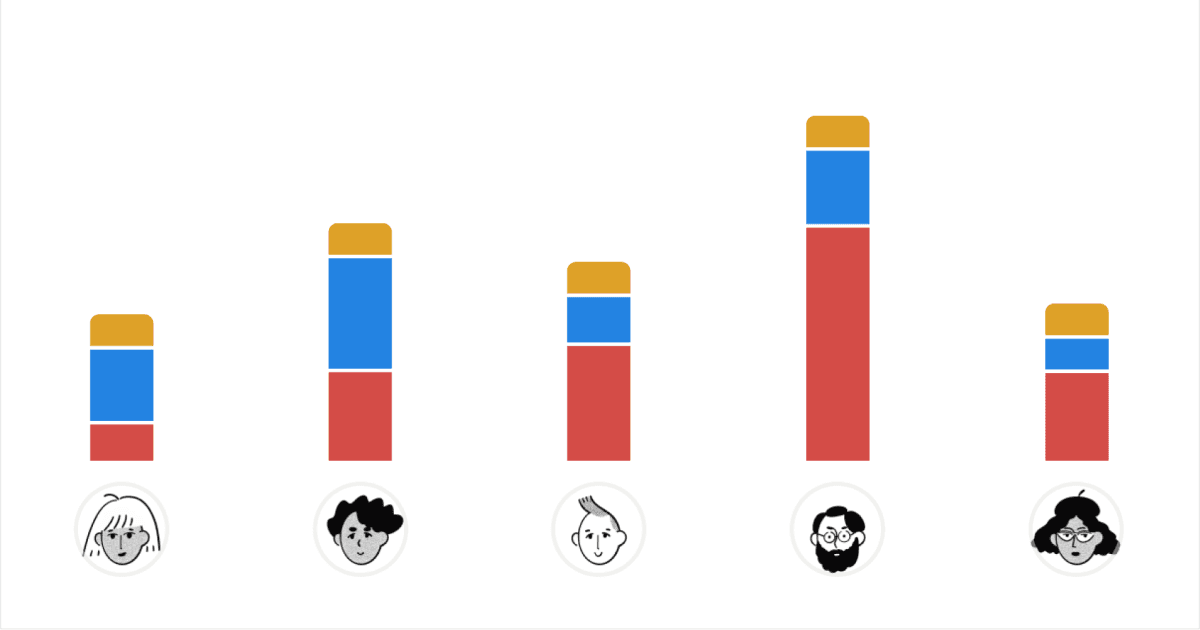
We’ve been having a blast playing around with charts here at Notion. Every year, our researchers survey thousands of Notion users to learn more about why they love, use, and value the tool (and where it falls short). We gathered a few highlights from our latest survey in chart form.
